6. Day 5: Metagenomics and Correlation in Life Sciences
6.1. Overview
6.1.1. Lead Instructor
6.1.2. Co-Instructor(s)
6.1.4. General Topics
- Metagenomics and Machine Learning
- Correlation and Linear Regression in Life Sciences
6.2. Schedule
- 09:00 - 10:00 Metagenomics and Machine Learning
- 10:00 - 11:00 Correlation and Linear Regression in Life Sciences
- 11:00 - 11:30 Coffee break
- 11:30 - 12:30 Closing, Final Remarks, Post-workshop survey
- 12:30 - 14:00 Lunch break
6.3. Learning Objectives
- Basic overview of metagenomics: difference between targeted and shotgun metagenomics
- Overview of the different Machine Learning techniques / tools useful in metagenomics
- Understanding of the difference between pearson, spearman and kendall correlation
- Understanding of the underlying assumptions of pearson correlation
6.5. Correlation and Linear Regression in Life Sciences
6.5.1. Loading our dataset
For this episode, we will be using the ecoli dataset from the UCI Machine Learning Repository. The dataset contains 336 records (instances), each of which has 8 attributes (columns).
You can download the data also from here.
After downloading the data, we will load it in RStudio as follows:
dataSet <- read.csv(file = "ecoli.csv", header = TRUE, sep = ",", stringsAsFactors = TRUE)
6.5.2. Basic Inspection of Your Data
It’s a good idea, once a data frame has been imported, to get an idea about your data. First, check out the structure of the data that is being examined. Below you can see the results of using this super-simple, helpful function str():
str(dataSet)
'data.frame':   336 obs. of  9 variables:
$ Seq.Name: Factor w/ 336 levels "AAS_ECOLI","AAT_ECOLI",..: 2 3 4 5 6 8 9 12 13 14 ...
$ mcg     : num  0.49 0.07 0.56 0.59 0.23 0.67 0.29 0.21 0.2 0.42 ...
$ gvh     : num  0.29 0.4 0.4 0.49 0.32 0.39 0.28 0.34 0.44 0.4 ...
$ lip     : num  0.48 0.48 0.48 0.48 0.48 0.48 0.48 0.48 0.48 0.48 ...
$ chg     : num  0.5 0.5 0.5 0.5 0.5 0.5 0.5 0.5 0.5 0.5 ...
$ aac     : num  0.56 0.54 0.49 0.52 0.55 0.36 0.44 0.51 0.46 0.56 ...
$ alm1    : num  0.24 0.35 0.37 0.45 0.25 0.38 0.23 0.28 0.51 0.18 ...
$ alm2    : num  0.35 0.44 0.46 0.36 0.35 0.46 0.34 0.39 0.57 0.3 ...
$ class   : Factor w/ 8 levels "cp","im","imL",..: 1 1 1 1 1 1 1 1 1 1 ...
In this particular data frame, you can see from the console that 336 observations of 9 variables are present. Another great function to help us perform a quick, high-level overview of our data frame is summary(). Note the similarities and differences between the output produced by runningstr().
summary(dataSet)
       Seq.Name        mcg              gvh            lip              chg              aac
 AAS_ECOLI :  1   Min.   :0.0000   Min.   :0.16   Min.   :0.4800   Min.   :0.5000   Min.   :0.000
 AAT_ECOLI :  1   1st Qu.:0.3400   1st Qu.:0.40   1st Qu.:0.4800   1st Qu.:0.5000   1st Qu.:0.420
 ACEA_ECOLI:  1   Median :0.5000   Median :0.47   Median :0.4800   Median :0.5000   Median :0.495
 ACEK_ECOLI:  1   Mean   :0.5001   Mean   :0.50   Mean   :0.4955   Mean   :0.5015   Mean   :0.500
 ACKA_ECOLI:  1   3rd Qu.:0.6625   3rd Qu.:0.57   3rd Qu.:0.4800   3rd Qu.:0.5000   3rd Qu.:0.570
 ADI_ECOLI :  1   Max.   :0.8900   Max.   :1.00   Max.   :1.0000   Max.   :1.0000   Max.   :0.880
 (Other)   :330
      alm1             alm2            class
 Min.   :0.0300   Min.   :0.0000   cp     :143
 1st Qu.:0.3300   1st Qu.:0.3500   im     : 77
 Median :0.4550   Median :0.4300   pp     : 52
 Mean   :0.5002   Mean   :0.4997   imU    : 35
 3rd Qu.:0.7100   3rd Qu.:0.7100   om     : 20
 Max.   :1.0000   Max.   :0.9900   omL    :  5
                                   (Other):  4
A short description of the content of each attribute (as provided by UCI) is this:
- Seq.Name: Accession number for the SWISS-PROT database
- mcg: McGeoch’s method for signal sequence recognition.
- gvh: von Heijne’s method for signal sequence recognition.
- lip: von Heijne’s Signal Peptidase II consensus sequence score. Binary attribute.
- chg: Presence of charge on N-terminus of predicted lipoproteins. Binary attribute.
- aac: score of discriminant analysis of the amino acid content of outer membrane and periplasmic proteins.
- alm1: score of the ALOM membrane spanning region prediction program.
- alm2: score of ALOM program after excluding putative cleavable signal regions from the sequence.
- class: The class is the localization site.
- cp cytoplasm
- im inner membrane without signal sequence
- pp perisplasm
- imU inner membrane, uncleavable signal sequence
- om outer membrane
- omL outer membrane lipoprotein
- imL inner membrane lipoprotein
- imS inner membrane, cleavable signal sequence
6.5.3. Methods for correlation analyses
(the following exercises are based on the STHDA lesson and the Data Camp Lesson)
There are different methods to perform correlation analysis:
- Pearson correlation (r), which measures a linear dependence between two variables (x and y). It’s also known as a parametric correlation test because it depends to the distribution of the data. It can be used only when x and y are from normal distribution. The plot of y = f(x) is named the linear regression curve.
- Kendall tau and Spearman rho, which are rank-based correlation coefficients (non-parametric)
The most commonly used method is the Pearson correlation method.
Be careful, because there are always some assumptions that these correlations work with: the Kendall and Spearman methods only make sense for ordered inputs. This means that you’ll need to order your data before calculating the correlation coefficient.
Additionally, the default method, the Pearson correlation, assumes that your variables are normally distributed, that there is a straight line relationship between each of the variables and that the data is normally distributed about the regression line.
Note also that you can use rcorr(), which is part of the Hmisc package to compute the significance levels for pearson and spearman correlations.
6.5.4. Compute correlation in R
Correlation coefficient can be computed using the functions cor() or cor.test():
cor()computes the correlation coefficientcor.test()test for association/correlation between paired samples. It returns both the correlation coefficient and the significance level (or p-value) of the correlation.
The simplified formats are:
cor(x, y, method = c("pearson", "kendall", "spearman"))
cor.test(x, y, method=c("pearson", "kendall", "spearman"))
where
- x, y: numeric vectors with the same length
- method: correlation method
If your data contain missing values, use the following R code to handle missing values by case-wise deletion.
cor(x, y, method = "pearson", use = "complete.obs")
So, in our case let’s run:
cor(dataSet$mcg, dataSet$gvh,  method = "pearson", use = "complete.obs")

# [1] 0.4548053
6.5.5. Visualize your data using scatter plots
We will be using ggpubr to do our graphics. This is a library the contains “ggplot2 Based Publication Ready Plots”. We will also be using GGally which is an extension to ggplot2.
library("ggpubr")
library("GGally")
A correlation matrix enables us to quickly visualize which variables have a negative, positive, weak, or strong correlation to the other variables. The form of this function call will be ggcorr(df), where df is the name of the data frame you’re calling the function on. The output of this function will be a triangular-shaped, color-coded matrix labelled with our variable names. The correlation coefficient of each variable relative to the other variables can be found by reading across and / or down the matrix, depending on the variable’s location in the matrix.
ggcorr(dataSet, label = TRUE, label_alpha = TRUE)
(Note that this will produce a warning saying “data in column(s) ‘Seq.Name’, ‘class’ are not numeric and were ignored”).
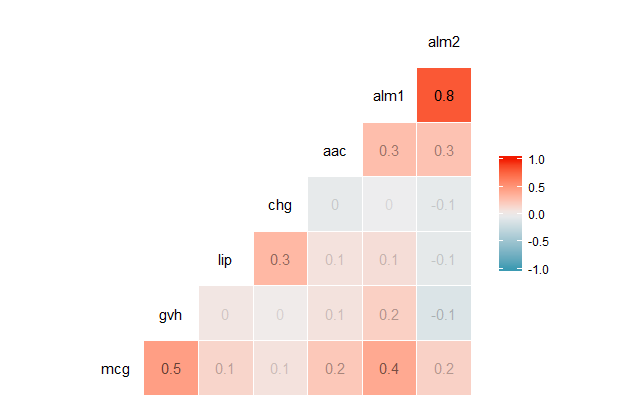
Correlation coefficients are always between -1 and 1, inclusive. A correlation coefficient of -1 indicates a perfect, negative fit in which y-values decrease at the same rate than x-values increase. A correlation coefficient of 1 indicates a perfect, positive fit in which y-values increase at the same rate that x-values increase.
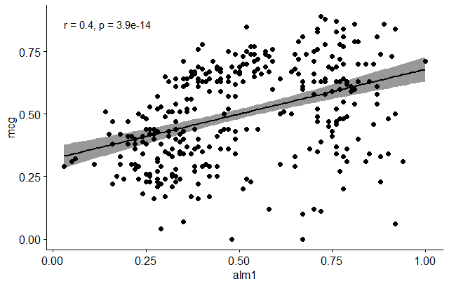
Let’s do now a scatter plot and see if we can visualize a relationship between some of the indicated variables, e.g. mcg and alm1. In order to do that, we’ll use the ggscatter function as follows:
ggscatter(dataSet, x = "alm1", y = "mcg",
          add = "reg.line", conf.int = TRUE,
          cor.coef = TRUE, cor.method = "pearson",
          xlab = "alm1", ylab = "mcg")
6.5.6. Preliminary test to check the test assumptions
- Is the covariation linear? Yes, form the plot above, the relationship is linear. In the situation where the scatter plots show curved patterns, we are dealing with nonlinear association between the two variables.
- Are the data from each of the 2 variables (x, y) follow a normal distribution?
- use Shapiro-Wilk normality test –> R function:
shapiro.test() - look at the normality plot —> R function:
ggpubr::ggqqplot()
- use Shapiro-Wilk normality test –> R function:
Shapiro-Wilk test can be performed as follows:
# Null hypothesis: the data are normally distributed
# Alternative hypothesis: the data are not normally distributed
# Shapiro-Wilk normality test for alm1
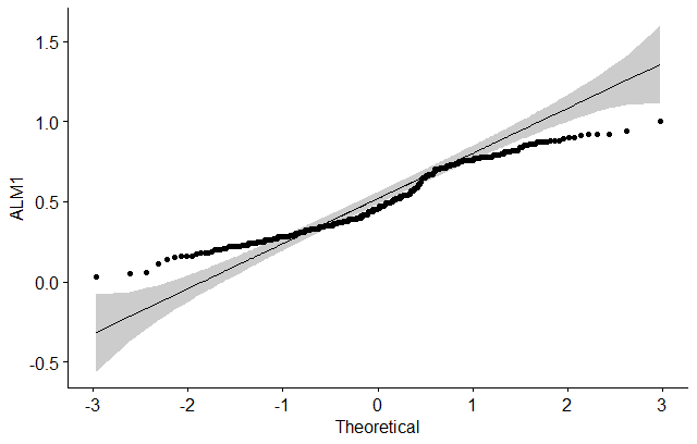
shapiro.test(dataSet$alm1) # => p = 1.431e-08
# Shapiro-Wilk normality test for mcg
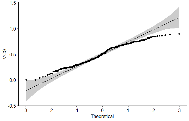
shapiro.test(dataSet$mcg) # => p = 8.231e-06
Finally, let’s do a visual inspection of the data normality using Q-Q plots (quantile-quantile plots). Q-Q plot draws the correlation between a given sample and the normal distribution.
# ALM1
ggqqplot(dataSet$alm1, ylab = "ALM1")
# MCG
ggqqplot(dataSet$mcg, ylab = "MCG")
6.5.7. Pearson correlation test
Let’s do now a correlation test between ALM1 and MCG variables:
res <- cor.test(dataSet$alm1, dataSet$mcg, method = "pearson")
res
The output will be:
Pearson's product-moment correlation

data:  dataSet$alm1 and dataSet$mcg
t = 7.9046, df = 334, p-value = 3.95e-14
alternative hypothesis: true correlation is not equal to 0
95 percent confidence interval:
0.3028477 0.4834391
sample estimates:
    cor
0.3969786
In the result above :
- t is the t-test statistic value (
t = 7.9046), - df is the degrees of freedom (
df= 334), - p-value is the significance level of the t-test (
p-value = 3.95e-14). - conf.int is the confidence interval of the correlation coefficient at 95% (
conf.int = [0.3028477, 0.4834391]); - sample estimates is the correlation coefficient (
cor.coeff = 0.3969786).
6.5.8. Tying it all together
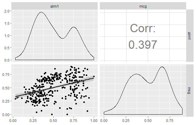
Let’s now take a look at another powerful function available in GGally called ggpairs. This function is great because it allows users to create a matrix that shows the correlation coefficient of multiple variables in conjunction with a scatterplot (including a line of best fit with a confidence interval) and a density plot.
Using this one function, you can effectively combine everything you’ve covered in this tutorial in a concise, readily comprehensible fashion.
ggpairs(dataSet,
        columns = c("alm1", "mcg"),
        upper = list(continuous = wrap("cor", size = 10)),
        lower = list(continuous = "smooth"))
Exercise
Try to do all the steps we show today, but instead of alm1 and mcg, use another pair of variables (e.g. alm1 and alm2).
- Do you see the difference in correlation?
- Try using the
ggpairsfunction, but with all the variables you studied (e.g.c("alm1", "alm2", "mcg")). Do you get a different interpretation of the results?